Officina Profumo Farmaceutica
Di Santa maria novella
Date: June 2021
Scope: Branding, Visual Identity & Packaging
Scope: Branding, Visual Identity & Packaging
The Client
Officina Profumo-Farmaceutica di Santa Maria Novella is known as Italy's oldest apothecary specializing in luxury beauty products. Their items are handmade using only natural, raw materials of the highest quality to produce a diverse range of products including skincare, fragrances, soaps, body care and more. By combining ancient traditions with modern technology, Farmaceutica Di Santa Maria Novella is recognized worldwide for its innovation and cultural heritage, leaving it at a high position in the marketplace.
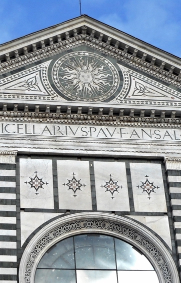
THE CHALLENGEOfficina Profumo-Farmaceutica di S.M.N is looking for a new visual identity that better represents the pharmacy in a contemporary style. The rebranding should capture and reflect the atmospherics and character of Florence with inspiration from the Santa Maria Novella Church facade. The client has asked to include a new logo, pattern design and packaging design for bags, paper wrap, labels and boxes.
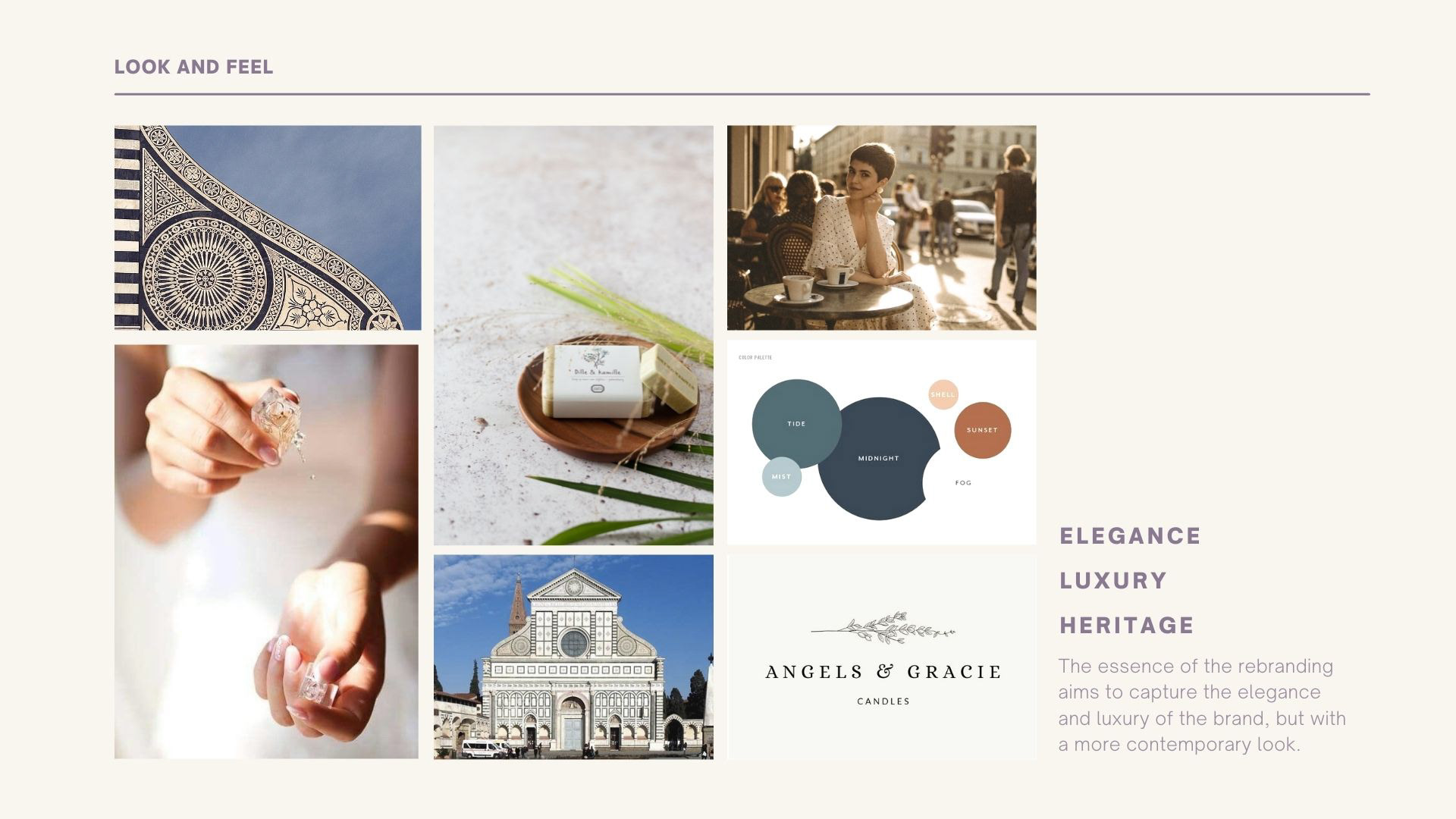
MOODBOARD
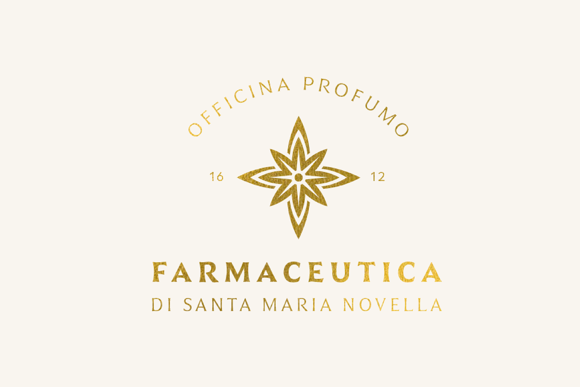
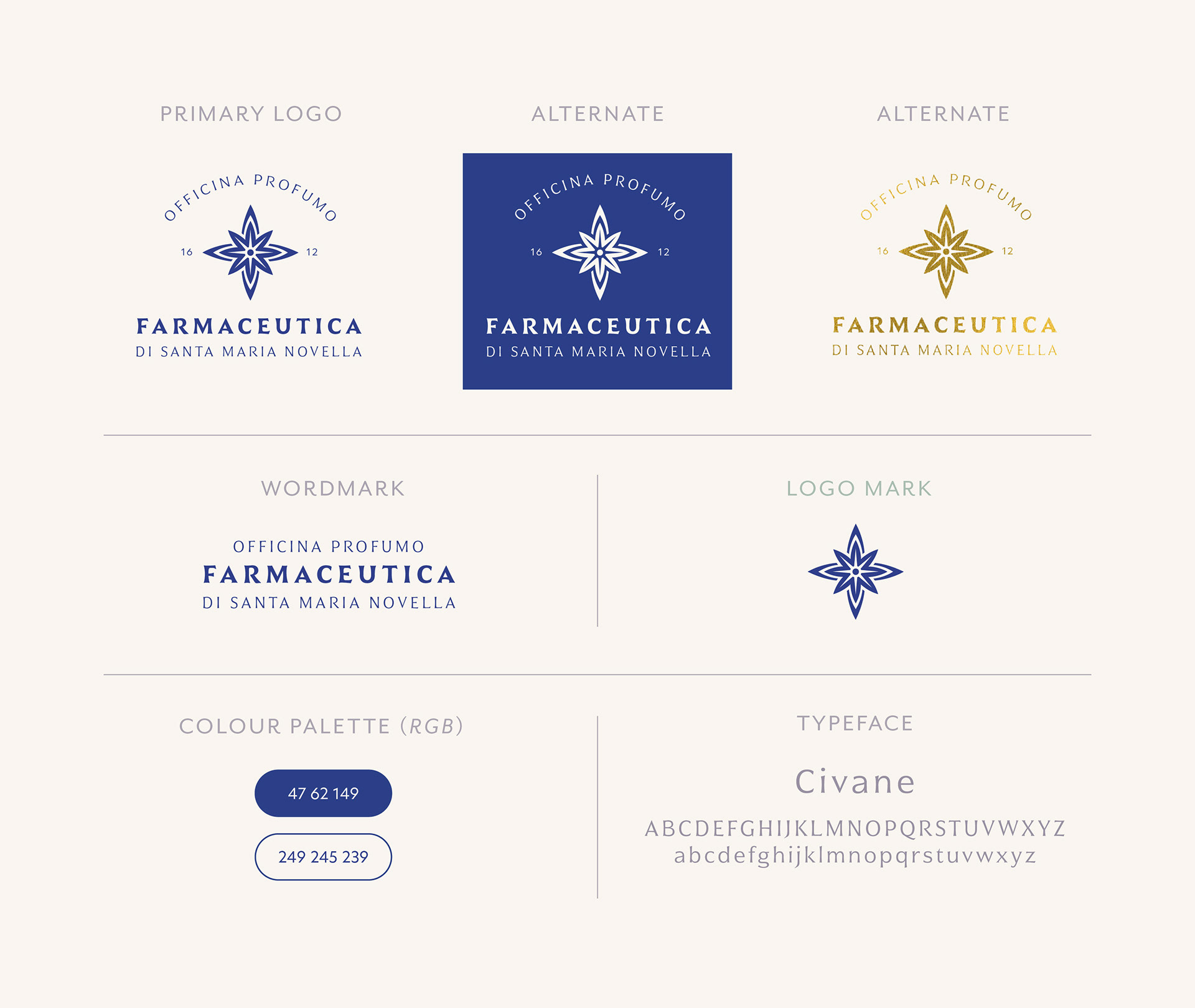
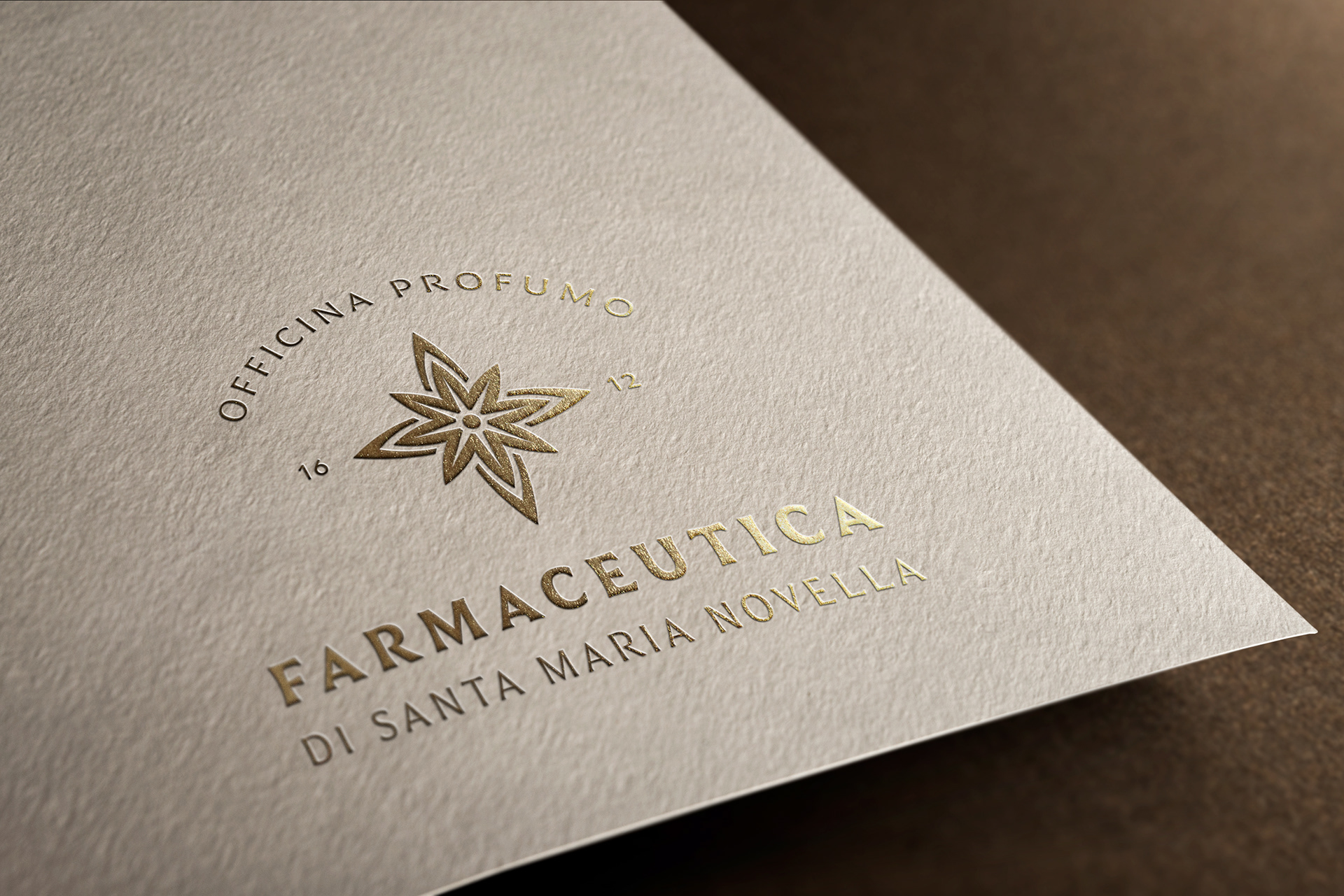
NEW LOGO
The new logo takes inspiration from the Santa Maria Novella Church facade. I decided to select a distinctive aspect of the church that would be easily memorable and strongly associated with the brand. The top half of the church was created by Leon Battista Alberti who created a system of architecture based on the ratios 2:1 and 3:1 inspired by musical scale. I followed his method of using basic shapes to create harmony, repetition and balance. The colours chosen represent luxury, royalty and sophistication while the font choice adds a classic, but fresh look.
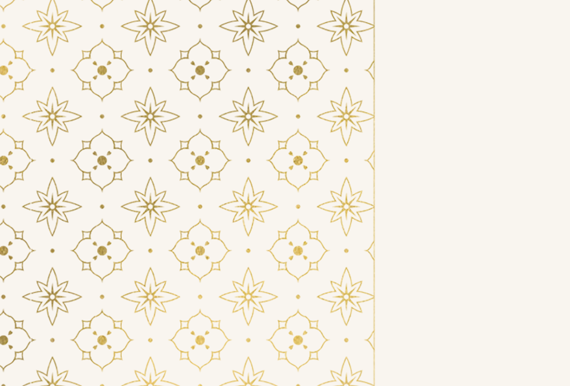
PATTERN DESIGN
Crafted as an integral part of the brand's visual identity, this pattern is versatile, and can be applied on various elements like stationary or packaging. Drawing inspiration from the Santa Maria Novella Church facade, much like the logo, it employs simple shapes to cultivate a dynamic aesthetic unique to the brand. The pattern has a delicate yet formal appearance, seamlessly aligning with the brand's image.
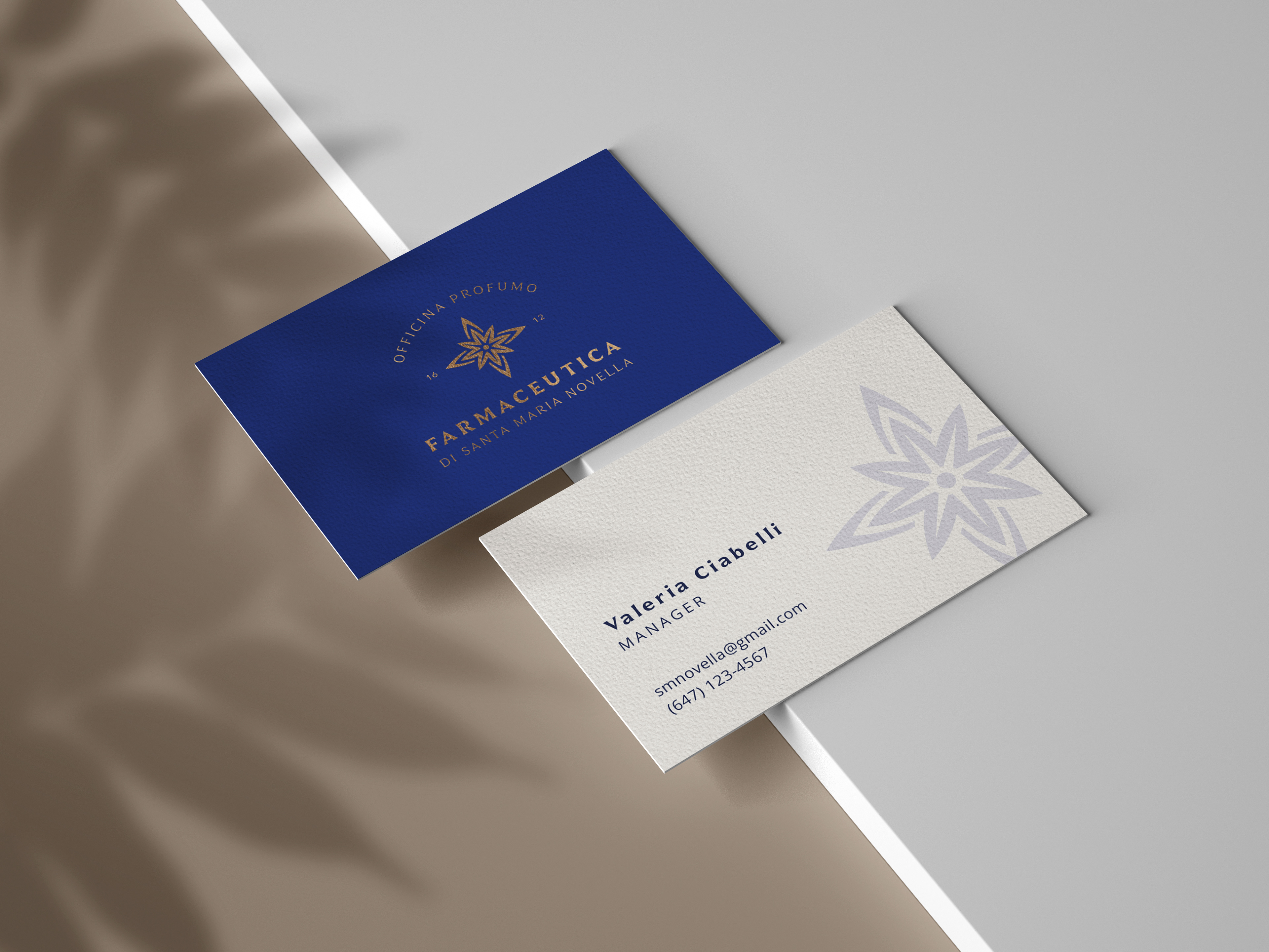

BUSINESS CARD
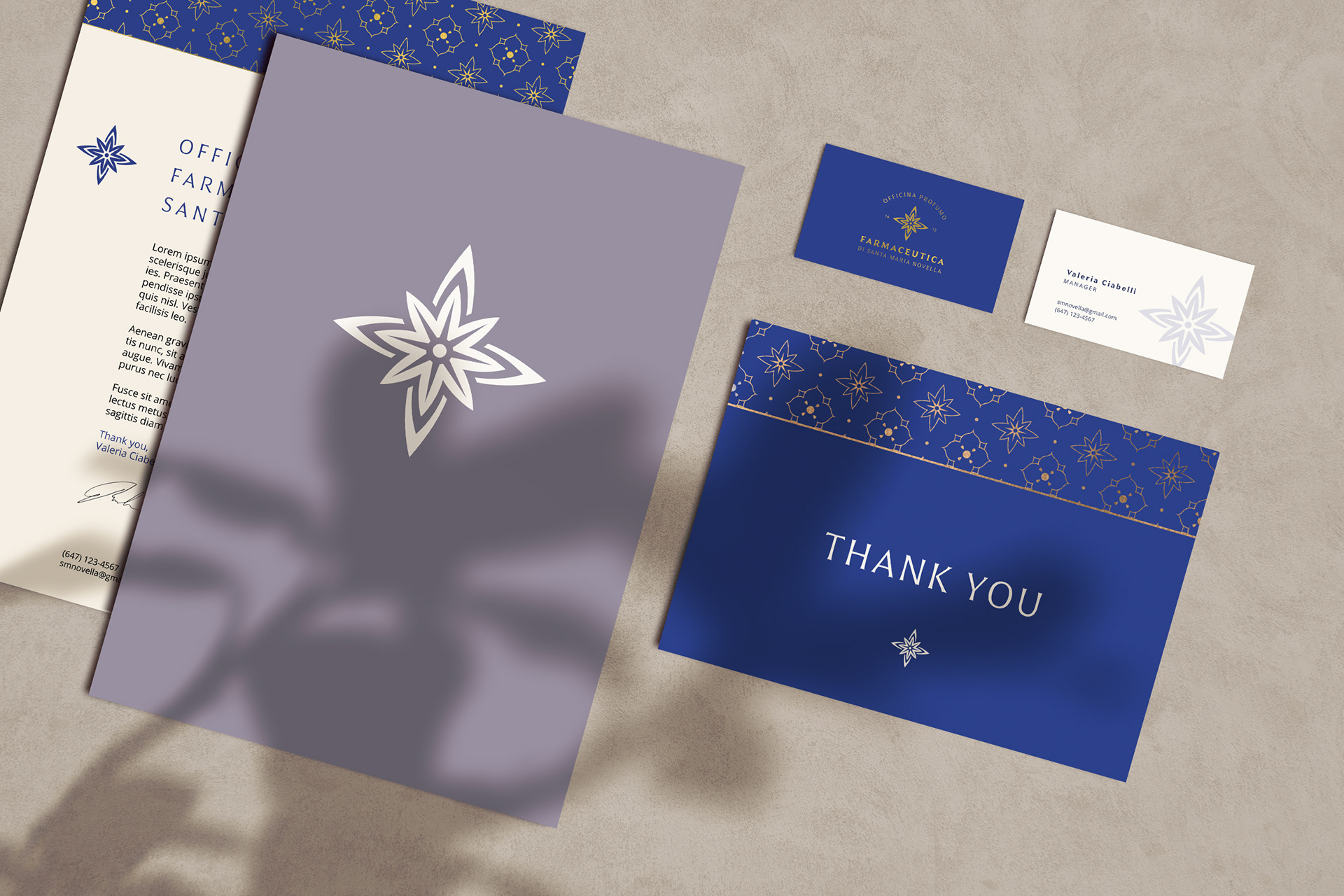
STATIONERY
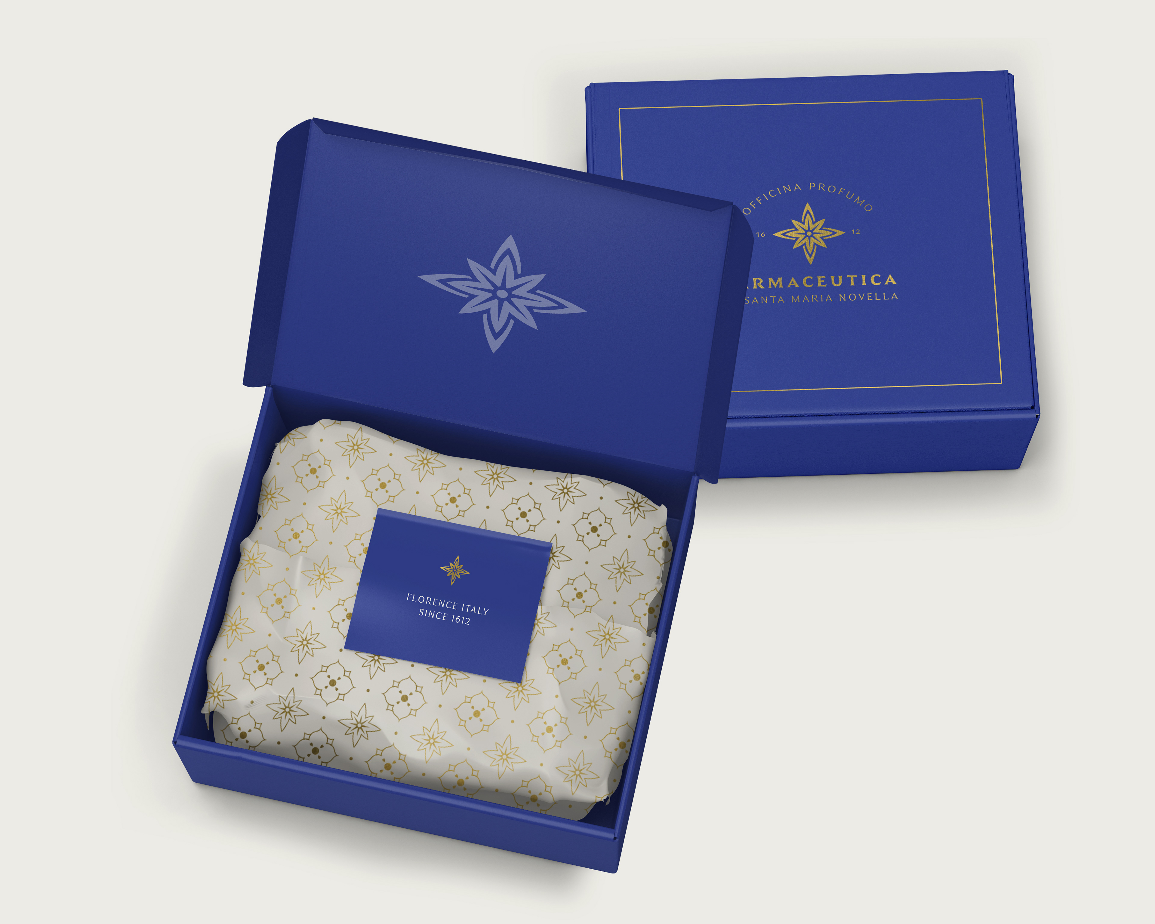
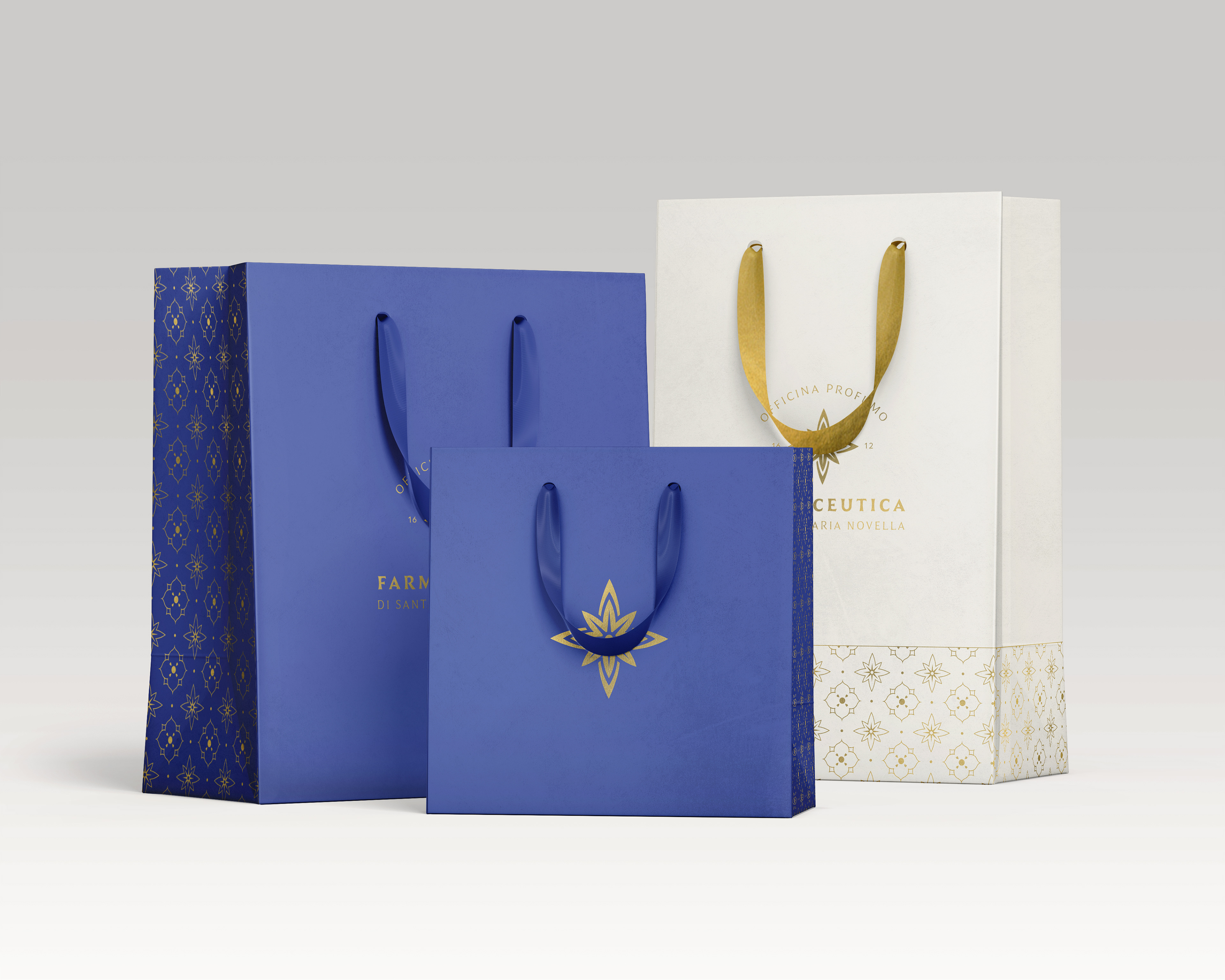
PACKAGING
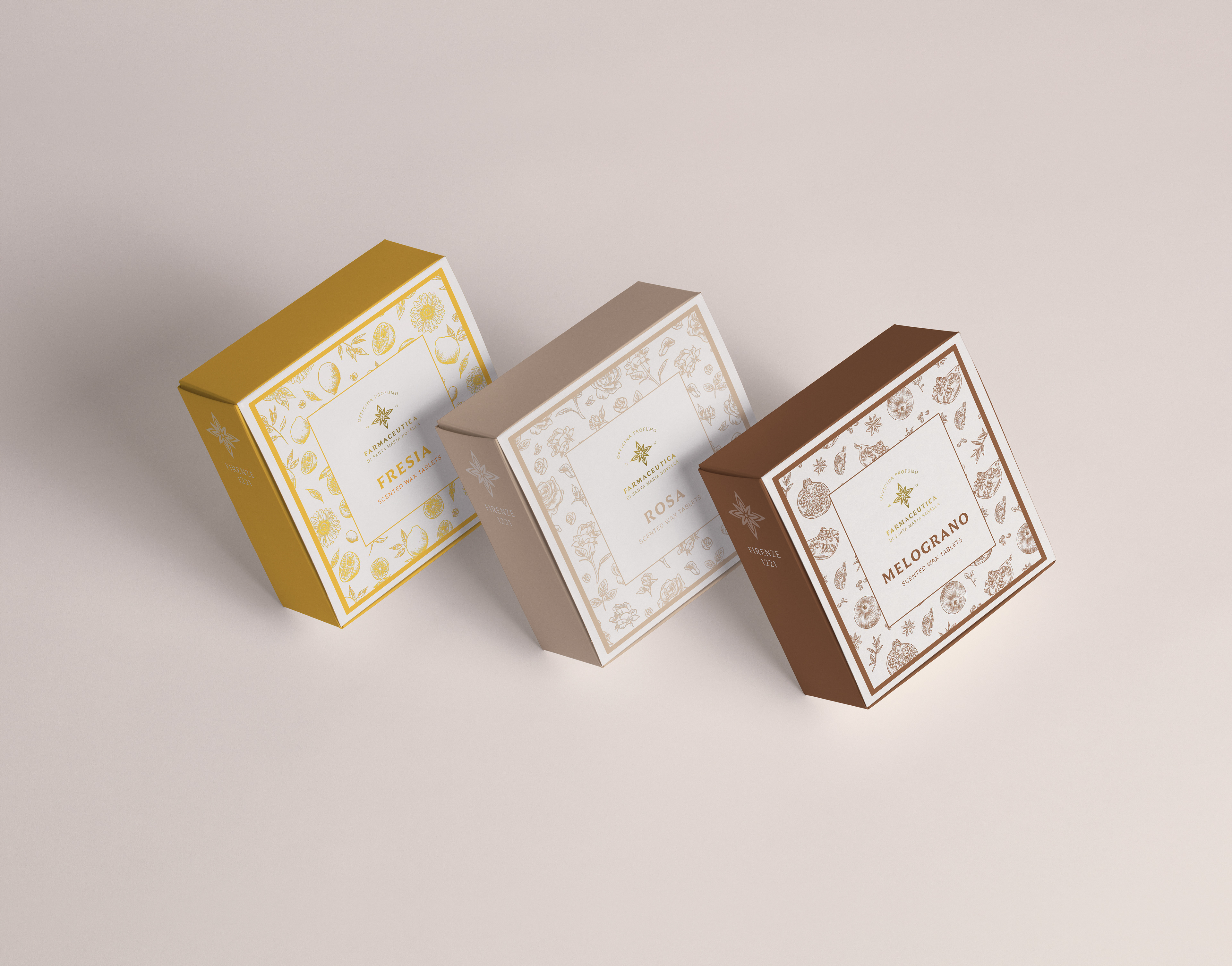
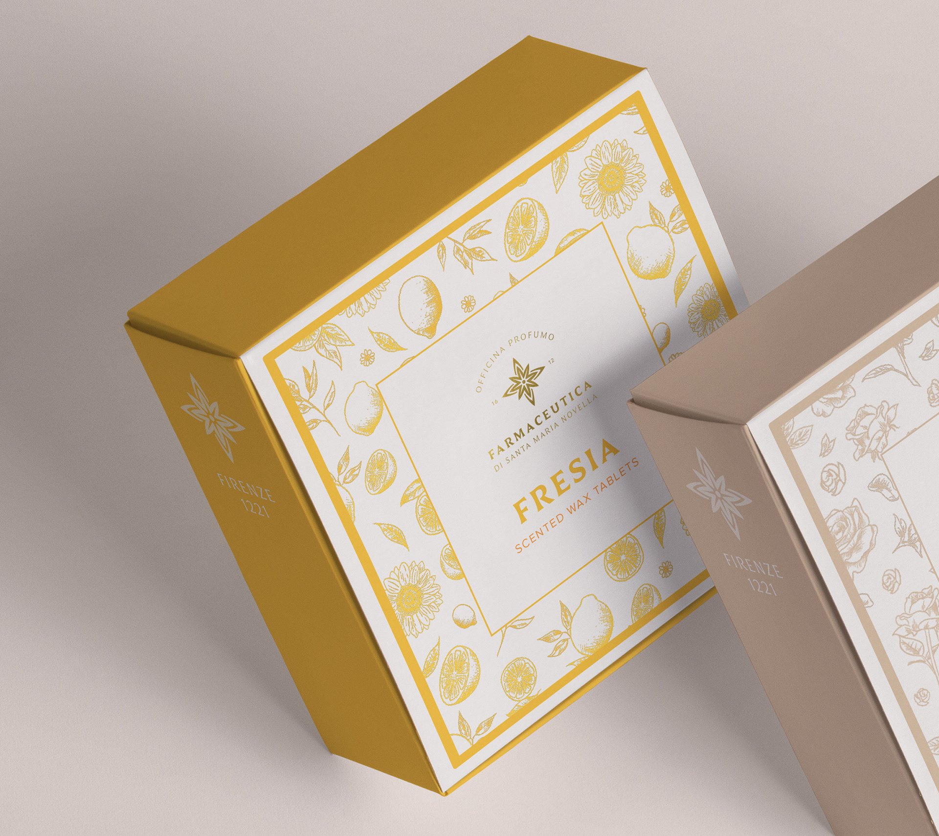
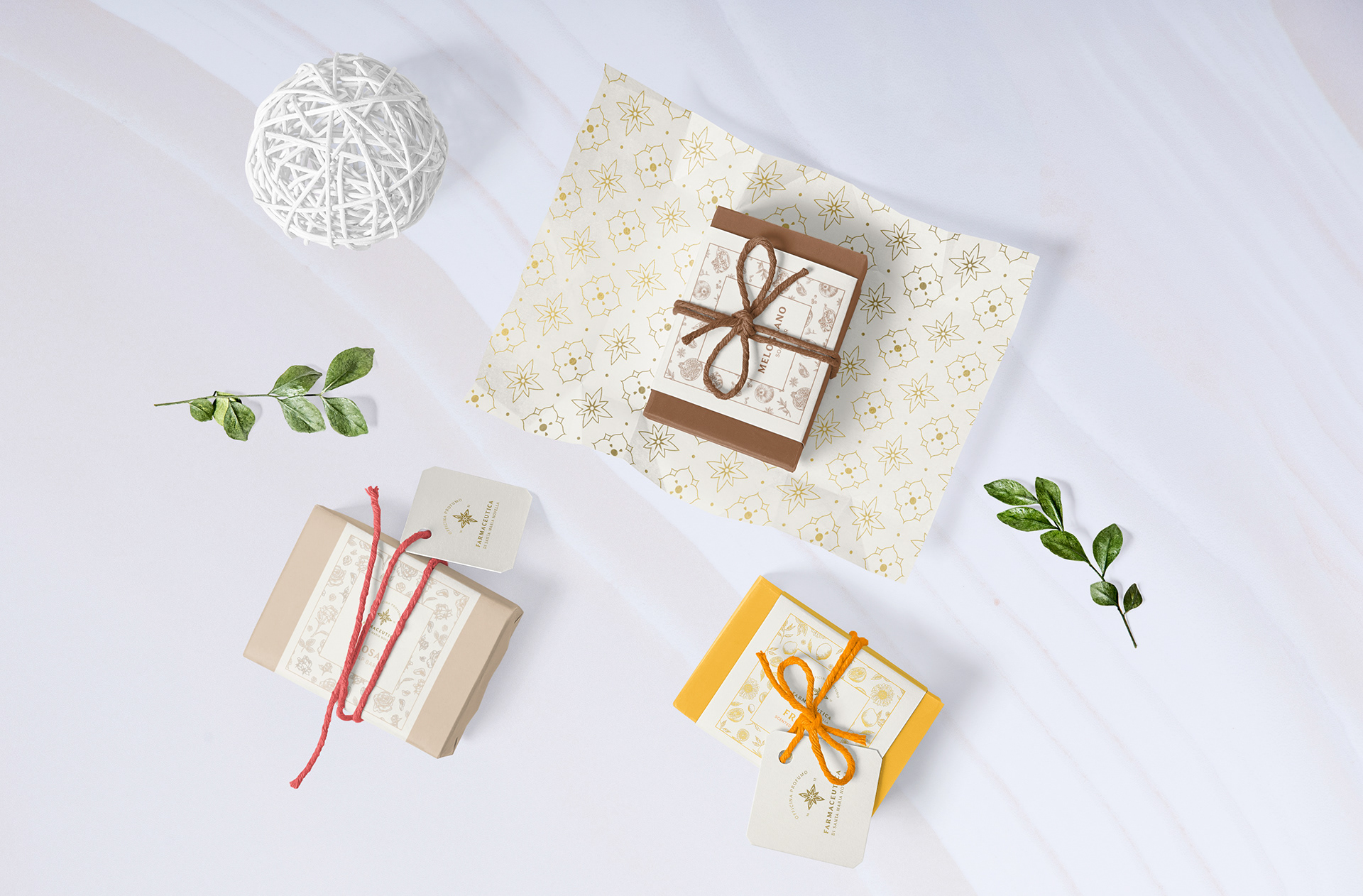
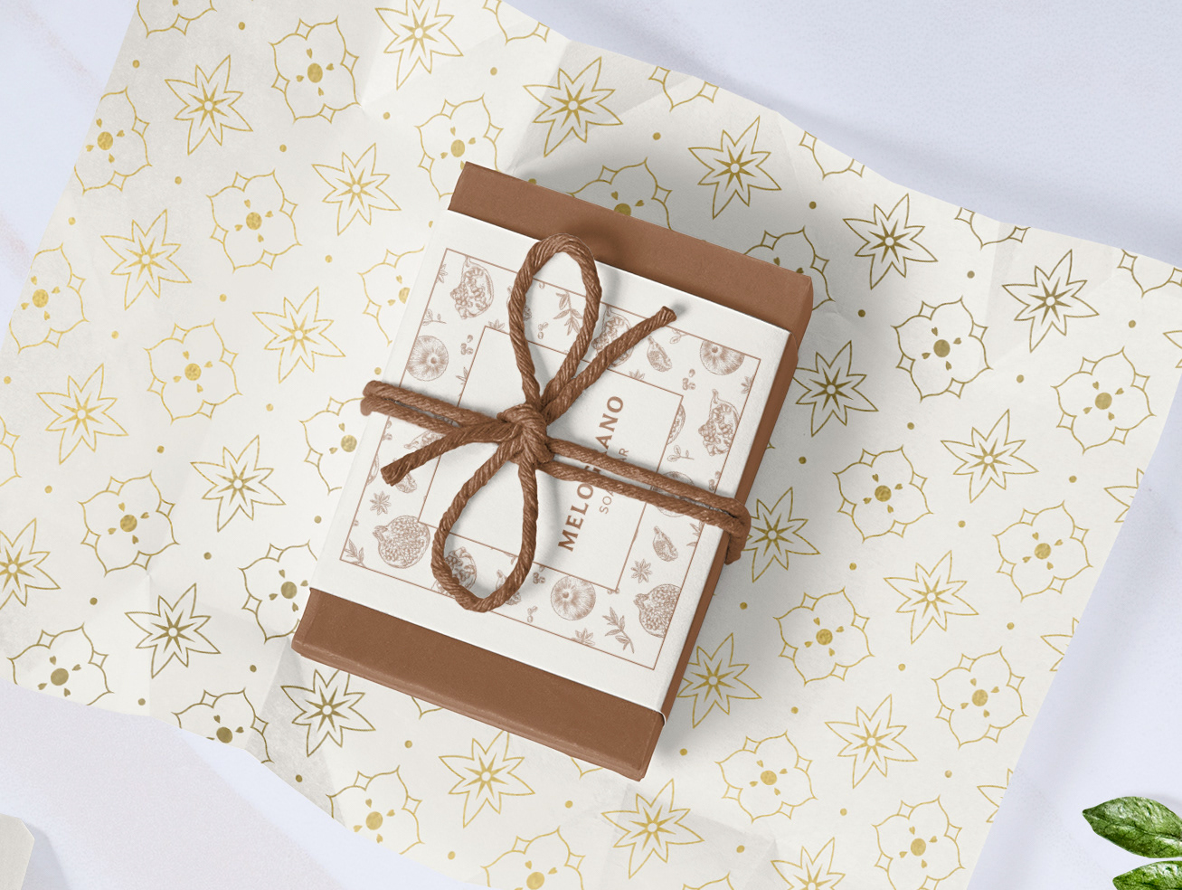
PRODUCT PACKAGING - WAX TABLETS
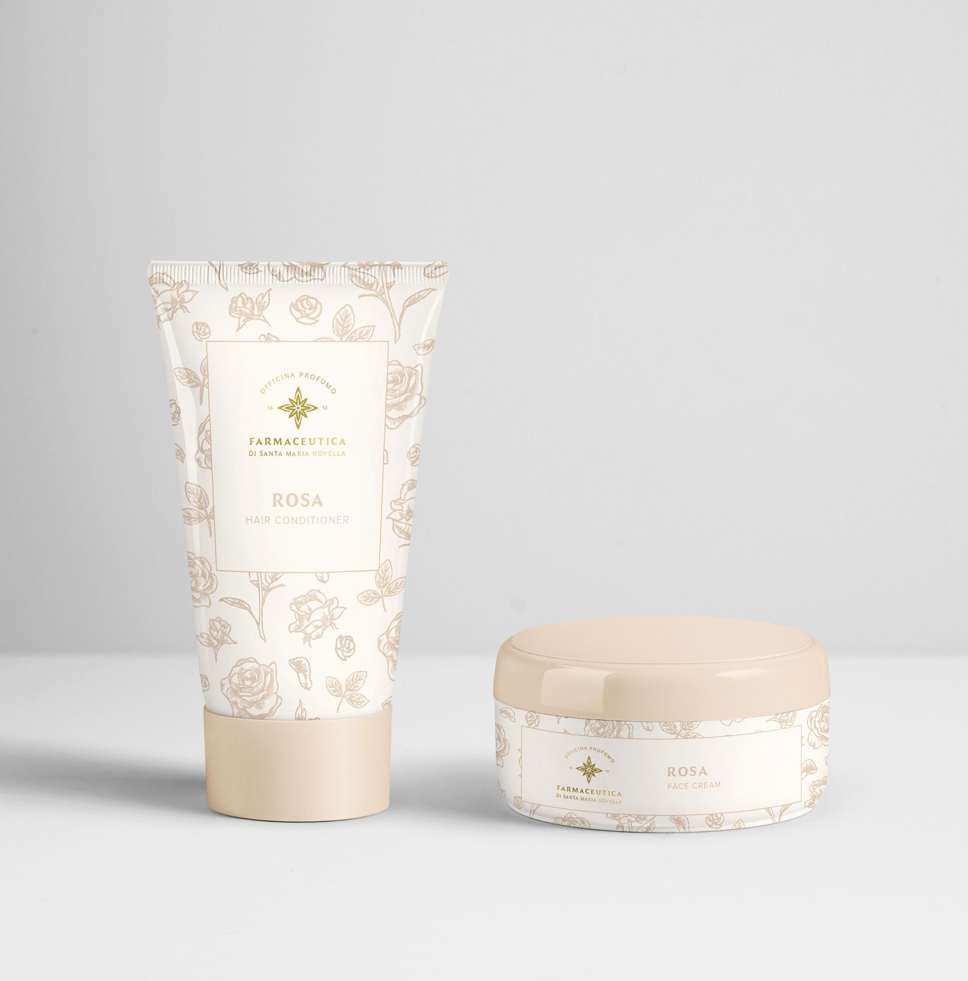
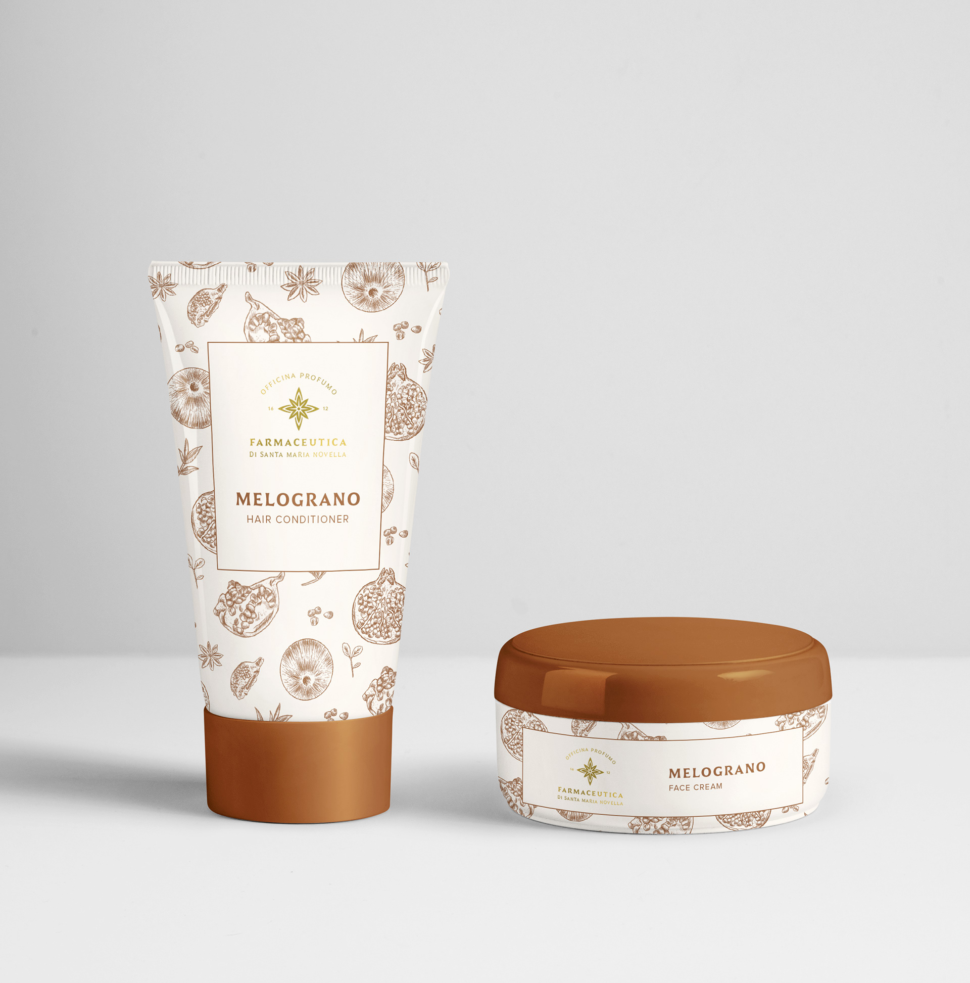
As part of the new packaging design, I was asked to create new designs for three product lines: Fresia, Rosa and Melograno. These fragrance lines represent the brand's most popular scents, each encompassing a variety of products, including wax tablets, soap bars, and skin/body care items.
In the design process, I chose to assign a distinct colour characteristic to each line, aligning with the unique scent of the products for easy differentiation. I decorated the boxes with hand-drawn sketches that depict the key features of the products. Deciding to include hand-drawn illustrations aligns seamlessly with the brand's commitment to "hand-crafted" methods, and imparts a natural and authentic look and feel to the overall design.
In the design process, I chose to assign a distinct colour characteristic to each line, aligning with the unique scent of the products for easy differentiation. I decorated the boxes with hand-drawn sketches that depict the key features of the products. Deciding to include hand-drawn illustrations aligns seamlessly with the brand's commitment to "hand-crafted" methods, and imparts a natural and authentic look and feel to the overall design.
SOAP BARS
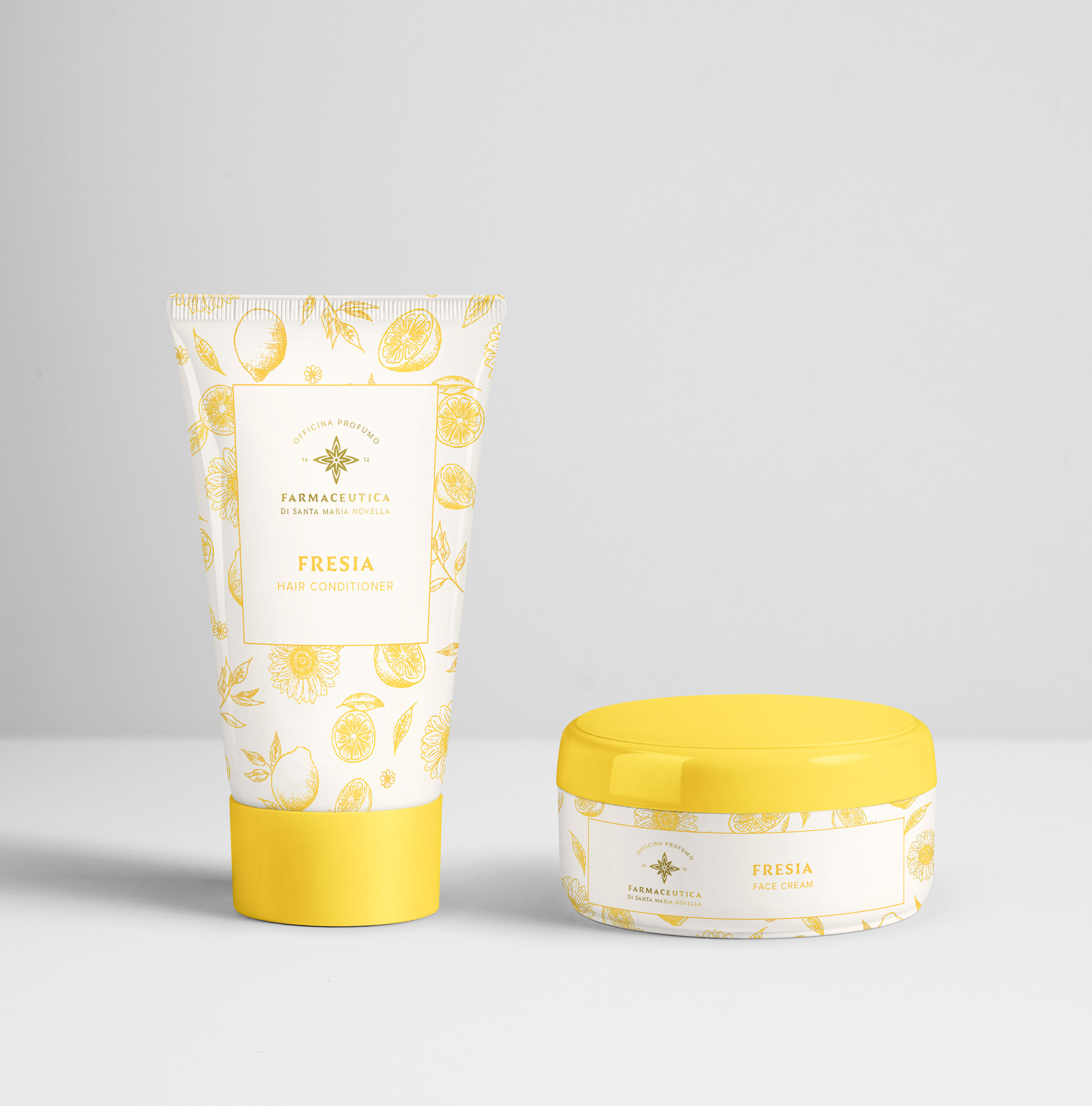
SKINCARE
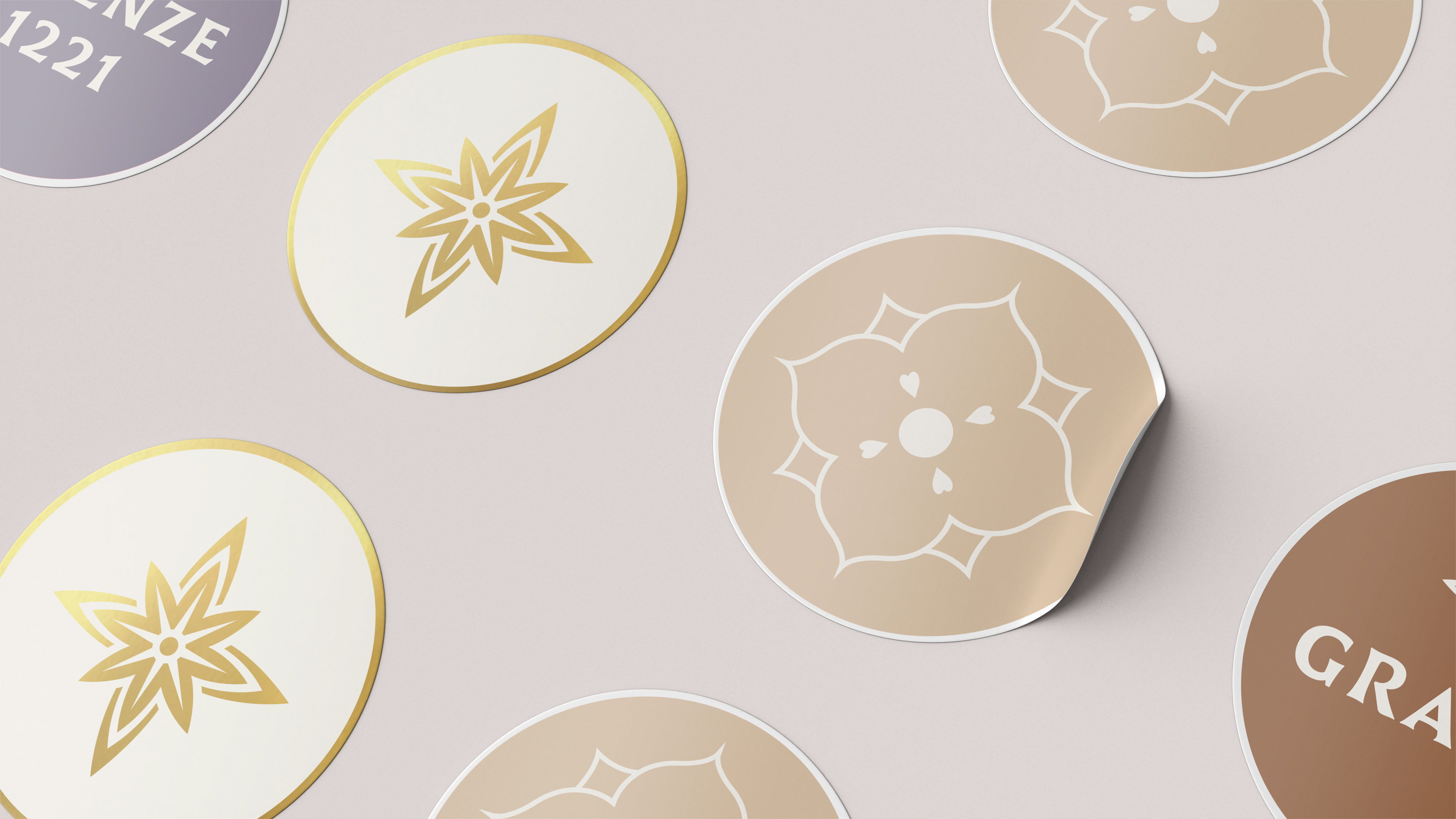
STICKERS
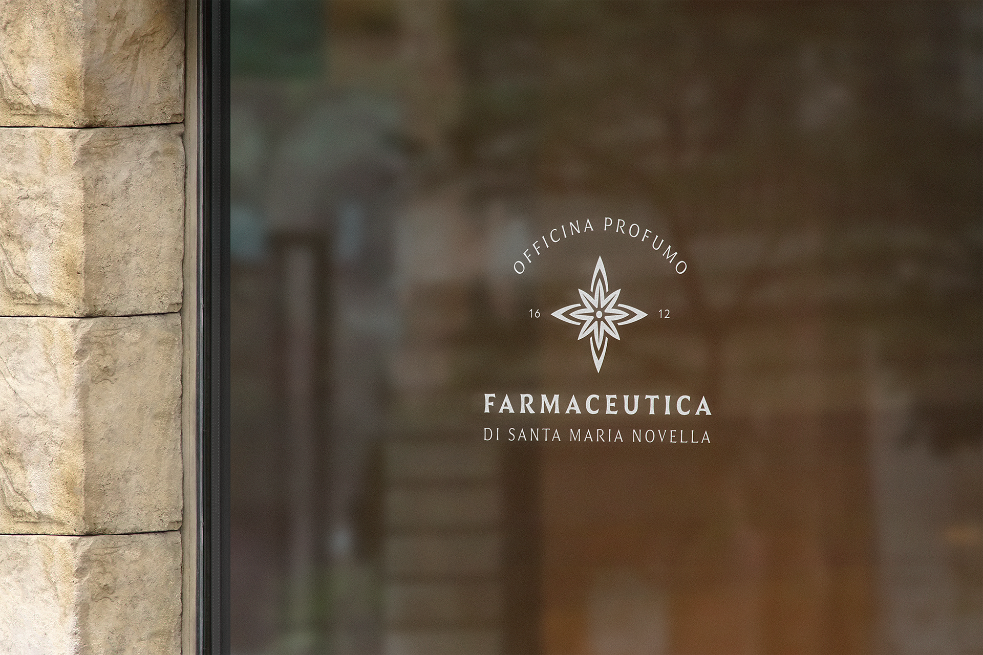
WINDOW DECAL